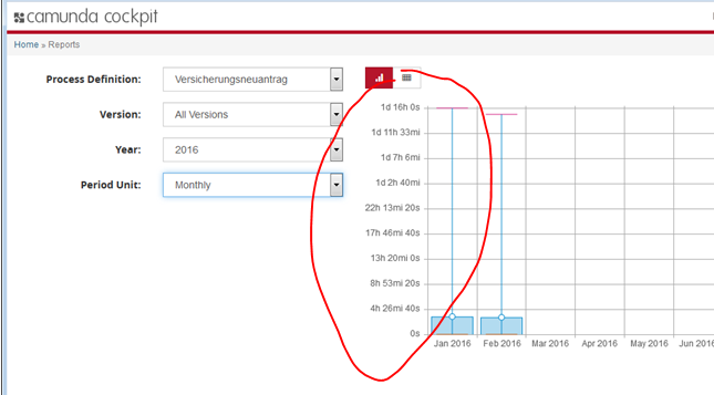
Currently the Y-Axis in the reporting view is hard to read.
The reason is that it shows very detailed numbers like minues and seconds even though the durations are a range of multiple days or hours.
AT:
- Y-axis less detailed numbers which are easier to consume
HINT:
I think that we need some sort of normalized skaling, that fits with a certain report but still uses typical numbers.
Example:
See attached screenshot. The scale should be something like
- 5hrs
- 10hrs
- 15hrs
- 20hrs
...
This is the controller panel for Smart Panels app
[CAM-5428] Improve labes of Y-Axis in reporting view
| Description |
Original:
Currently the Y-Axis in the reporting view is hard to read. The reason is that it shows very detailed numbers like minues and seconds even though the durations are a range of multiple days or hours. AT: - Y-axis less detailed numbers which are easier to consumer |
New:
Currently the Y-Axis in the reporting view is hard to read. The reason is that it shows very detailed numbers like minues and seconds even though the durations are a range of multiple days or hours. AT: - Y-axis less detailed numbers which are easier to consume |
| Description |
Original:
Currently the Y-Axis in the reporting view is hard to read. The reason is that it shows very detailed numbers like minues and seconds even though the durations are a range of multiple days or hours. AT: - Y-axis less detailed numbers which are easier to consume |
New:
Currently the Y-Axis in the reporting view is hard to read. The reason is that it shows very detailed numbers like minues and seconds even though the durations are a range of multiple days or hours. AT: - Y-axis less detailed numbers which are easier to consume HINT: I think that we need some sort of normalized skaling, that fits with a certain report but still uses typical numbers. |
| Attachment | New: screenshot-1.png [ 21557 ] |
| Description |
Original:
Currently the Y-Axis in the reporting view is hard to read. The reason is that it shows very detailed numbers like minues and seconds even though the durations are a range of multiple days or hours. AT: - Y-axis less detailed numbers which are easier to consume HINT: I think that we need some sort of normalized skaling, that fits with a certain report but still uses typical numbers. |
New:
Currently the Y-Axis in the reporting view is hard to read. The reason is that it shows very detailed numbers like minues and seconds even though the durations are a range of multiple days or hours. AT: - Y-axis less detailed numbers which are easier to consume HINT: I think that we need some sort of normalized skaling, that fits with a certain report but still uses typical numbers. Example: See attached screenshot. The scale should be something like - 5hrs - 10hrs - 15hrs - 20hrs ... |
| Rank | New: Ranked lower |
| Fix Version/s | New: 7.6.0 [ 14490 ] | |
| Fix Version/s | Original: 7.5.0 [ 14091 ] |
| Affects Version/s | Original: 7.5.0 [ 14091 ] |
| Fix Version/s | New: 7.7.0 [ 14607 ] | |
| Fix Version/s | Original: 7.6.0 [ 14490 ] |
| Fix Version/s | Original: 7.7.0 [ 14607 ] |
| Workflow | Original: camunda BPM [ 37625 ] | New: Backup_camunda BPM [ 55772 ] |