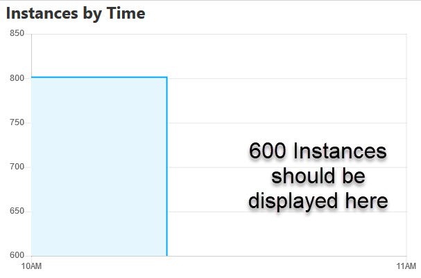
Report charts have confusing y-axis scale offset

XMLWordPrintable

    • Type: Bug Report
    • Resolution: Fixed
    • Priority: L3 - Default
    • 2.0.0
    • Affects Version/s: None
    • Component/s: frontend
    • None

      Problem
      the y-axis scale displays a range between the min and max value. This is confusing as the user has to respect the offset between 0 and minimum value. Furthermore it is not possible to display the minimum value in a bar chart (see attached screenshot).

      Expected Behavior
      1. Default behavior: the y-axis scale starts at 0.
      2. In some situations an offset makes sense to increase the readability. For example if values are very high but the range between min and max is very low (10100; 10010; 9900 ). In this case the offset should be lower than the minimum value.

        This is the controller panel for Smart Panels app

              Assignee:
              Unassigned
              Reporter:
              Michael Schoettes
              Votes:
              0 Vote for this issue
              Watchers:
              1 Start watching this issue

                Created:
                Updated:
                Resolved: