Uploaded image for project: 'Camunda Optimize'
  1. Camunda Optimize
  2. OPT-1869

Make look and feel of configuration options more consistent

XMLWordPrintable

    • Icon: Feature Request Feature Request
    • Resolution: Fixed
    • Icon: L3 - Default L3 - Default
    • 2.4.0
    • 2.3.0
    • frontend, UI
    • None

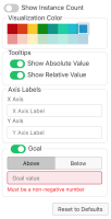
      Screenshot 2019-01-25 at 10.52.04.png shows the current state.
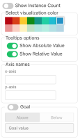
      I would suggest we try to make it more consistent, change some labels, add placeholder texts for the axis labels and also give the input full width:
      Screenshot 2019-01-25 at 10.59.03.png

        This is the controller panel for Smart Panels app

              Unassigned Unassigned
              felix.mueller Felix Mueller
              Votes:
              0 Vote for this issue
              Watchers:
              2 Start watching this issue

                Created:
                Updated:
                Resolved: