AT:
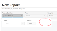
- the additional empty space in definition selection popover (see too-large-selection-popover.png
 ) is being removed when no tenant is available or there is only one tenant selectable, see here
 - if more then one tenant is available, the process definition selection popover should expand with the tenant select, e.g. see here
- if a some versions of the process definition contains multiple tenants and some contain only one, then the tenant select is disabled and has the title "--" for all versions where there is only one tenant available
Context:
When we added the selection of the tenant to the definition selection, we introduced additional empty space even if a tenant can't be selected. However, the additional introduced empty space is confusing and is actually not needed, since the dropdown for the tenant is hidden anyway.
