-
Type:
Bug Report
-
Resolution: Fixed
-
Priority:
 L3 - Default
-
Affects Version/s: None
-
Component/s: frontend
-
S
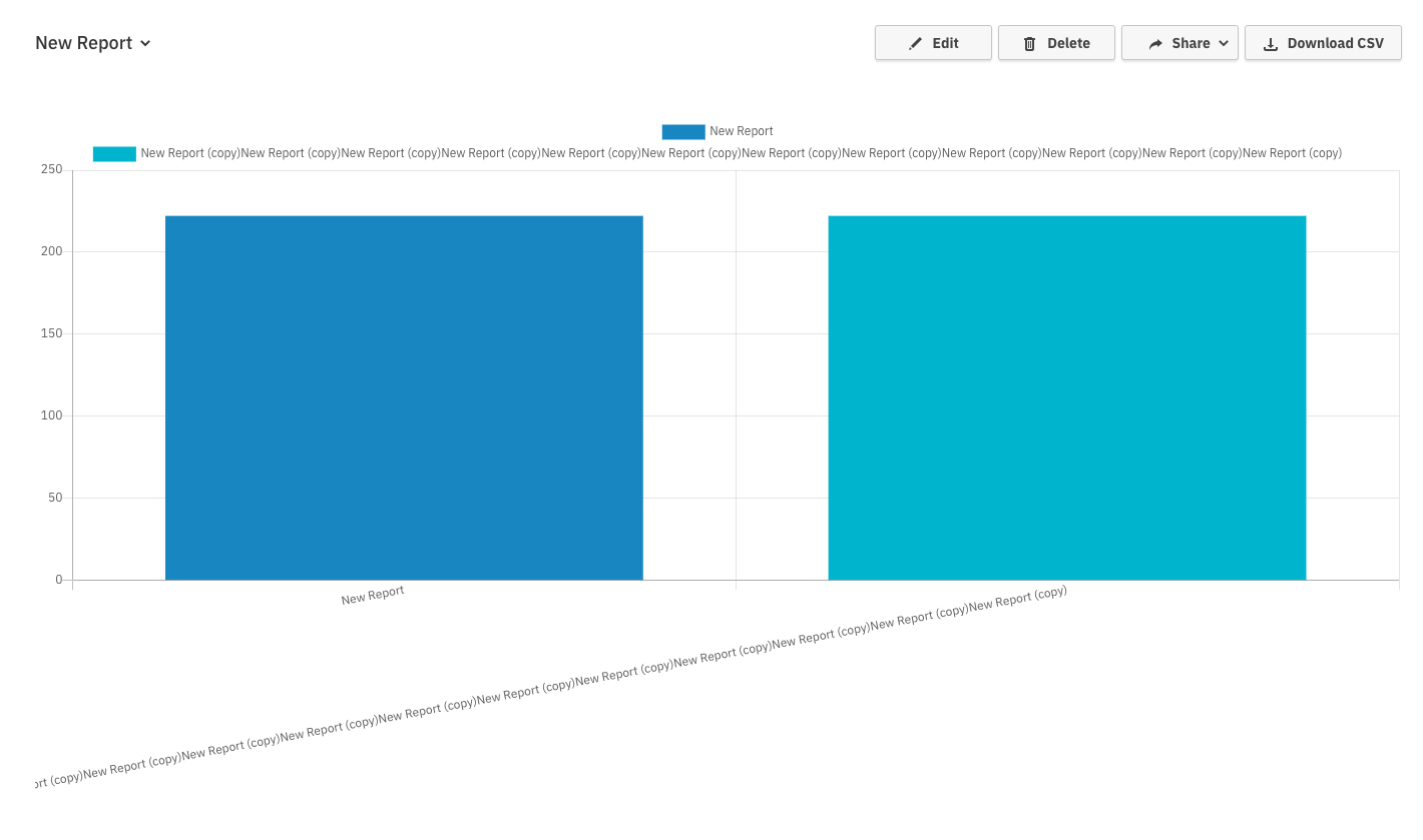
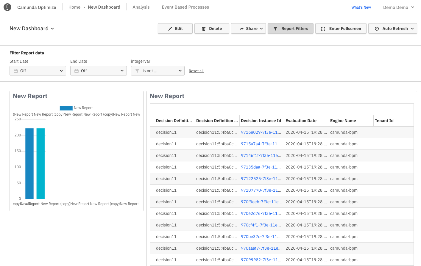
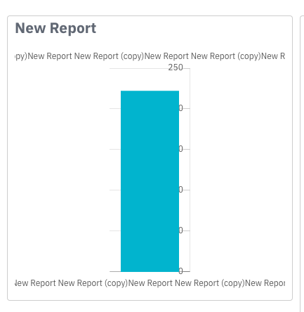
Reproduce:
I create a combined report. One of the included report has a name longer than 100 Characters.
I add this to my dashboard.
The added reports bard are squished to the left side.
(Exists in stage and showroom versions)
- Also resizing the dashboard breaks the long named process visualisation
Suggested fix options (either):
a) Display the charts with slanted labels at full width as we do in the standard visualisation
b) Fix this and other problems with a new chart layout design
Discuss when ticket picked up.

- is related to
-
OPT-4504 Improve Chart labels for long names
-
- Done
-