What are the steps to reproduce your problem?
Create a Dashboard
Create a Count Number Report with a filter and place it on the Dashboard (two square width)
Save Dashboard
What is the problem?
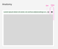
Notice that the report title is truncated very early - even though there is still place.
Most reports with smaller width titles cannot be read anymore.
What would be the expected behavior:
I can read most parts of the report name.
Hints (optional):
Design improvements:
• Display filter icon instead of text (In Dashboards only)
• 2px padding between text and dropdown icon
• Minimum viz width two (edit mode) spacing squares
Zeplin -> https://zpl.io/VDJrqDv


