-
Type:
Design Task
-
Resolution: Won't Do
-
Priority:
 L3 - Default
-
Affects Version/s: None
-
Component/s: None
-
None
-
Not defined
Problem:
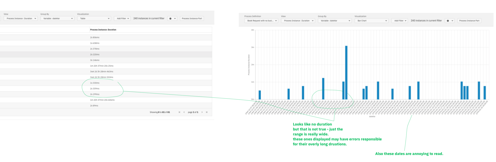
Our charts do not allow for tweaking of axies to support the user in telling the stories they want to tell with their data.
ie.
• Wide range of values hides some data from viz (see screenshot)
• Setting bounds is not possible
• Setting bucket ranges could be improved.
• ect.
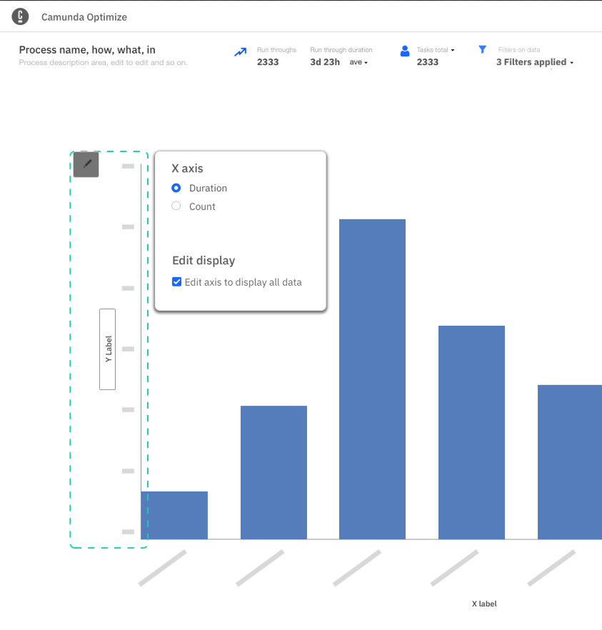
Concept:
Do not aim to give the users the perfect chart, but rather give them options to design a chart that is right for their data.
See idea screenshot.
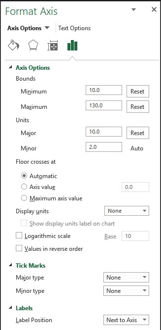
Based on Excel axis labels.
To do:
Discuss with Helene about her discovered issues with visualisations
Great article about dealign with ranges of values pros and cons:
https://peltiertech.com/chart-a-wide-range-of-values/|https://peltiertech.com/chart-a-wide-range-of-values/]