Uploaded image for project: 'Camunda Optimize'
  1. Camunda Optimize
  2. OPT-4217

Clarify the naming association between chart and flow node names on distributed by flownode reports

    XMLWordPrintable

Details

    • Task
    • Resolution: Fixed
    • L3 - Default
    • 3.3.0-alpha2, 3.3.0
    • None
    • frontend
    • None

    Description

      Context:
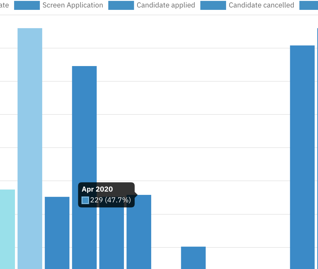
      It currently not clear which flow node is associated with which bar in the visualization when we distribute by flow nodes because if we have too many flow nodes we run out of colors.

      we could potentially add flownode name in the tooltip or/and fix the coloring issue

      mgm-controller-panel

        This is the controller panel for Smart Panels app

        Attachments

          Activity

            People

              Unassigned Unassigned
              omran.abazeed Omran Abazeed
              Votes:
              0 Vote for this issue
              Watchers:
              2 Start watching this issue

              Dates

                Created:
                Updated:
                Resolved:

                Salesforce