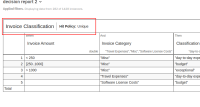
Small visual glitch in the header of a decision grouped by rule report on a dashboard that.
See by comparing screenshot from dashboard view:

Browser: Chrome 87.0.4280.88, OS Linux
Given:
A decision grouped by rule report
When:
added to a dashboard
Then:
The decision table header showing the definition name and hit policy is misaligned
Expected:
the table layout should be nearly identical to the report view
