-
Type:
Bug Report
-
Resolution: Fixed
-
Priority:
 L3 - Default
-
Affects Version/s: None
-
None
-
Not defined
Brief summary of the bug. What is it ? Where is it ?
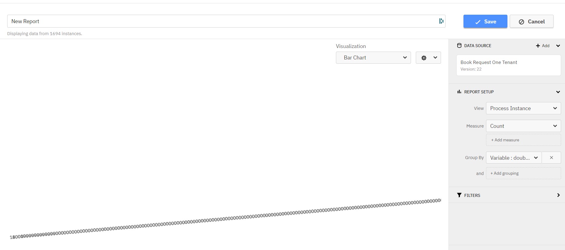
Evaluating a chart report with extremely long x axis labels, for example due to very high variable values in a variable report, results in an unreadable chart (see attached screenshot).
Steps to reproduce:
- Create a variable report for a variable with very high values, for example:
- process: Book request one tenant
- View: Process instance
- GroupBy: Variable: doubleVar
- Visualisation: bar chart
Actual result :
See attached screenshot. I believe this is because the labels of the buckets are very long (for example
"key" : "10000000000000000000000000000000000000000000000000000000000000000000000000000000000000000000000000000000000000000000000000000000000000000000000000000000000000000000000000000000000000000000000000000000000000000000000000000000000000000000000000000000000000000000000000000000000000000000000000000000000000000.00",)
Expected result:
A readable chart.
We should consider if we can format these keys to be more readable, for example by using exponential notation. This would probably need to be done in the frontend, but lets evaluate whether a BE solution is also available.