-
Type:
Bug Report
-
Resolution: Fixed
-
Priority:
L3 - Default
-
Affects Version/s: None
-
Component/s: None
-
None
-
Not defined
What are the steps to reproduce your problem?
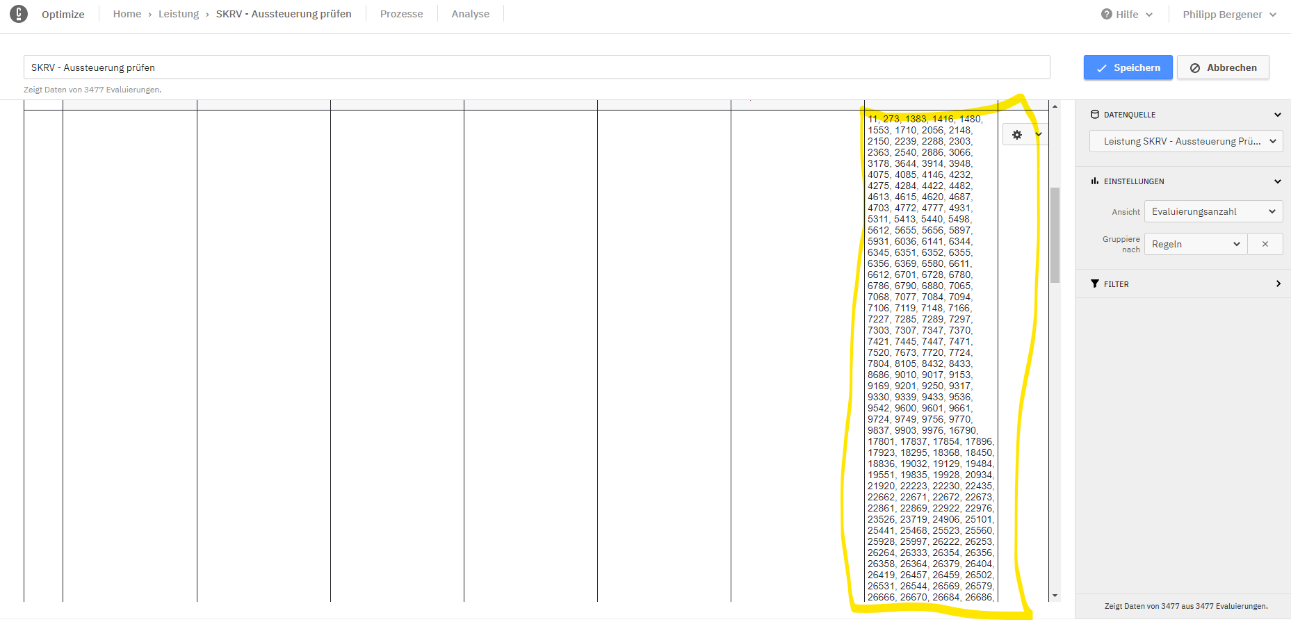
Given a DMN with a large cell, create a decision report for evaluation count grouped by rule like this:
Add this report to a dashboard with at least one report below it.
What is the problem?
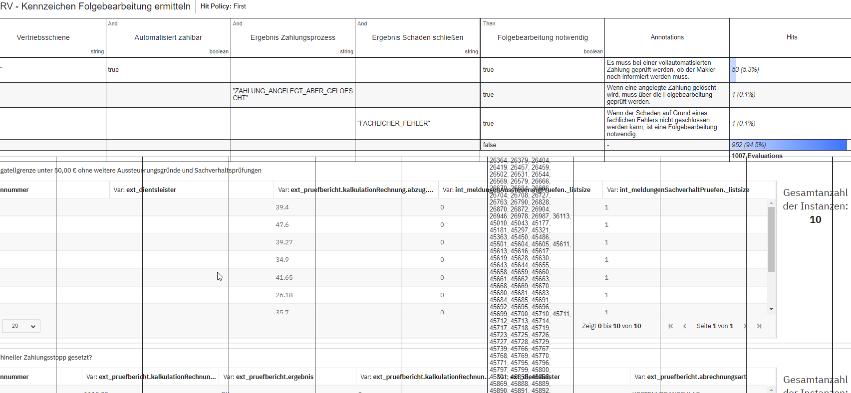
The layout of the dashboard breaks. The decision report with the large cell overlays the report below:

What would be the expected behavior:
The dashboard layout can handle the decision report with the large cell, e.g. by using a horizontal scroll bar.


