-
Type:
Task
-
Resolution: Fixed
-
Priority:
L3 - Default
-
Affects Version/s: None
-
Component/s: frontend
-
None
-
Not defined
Context:
In this guide here:
https://carbondesignsystem.com/components/tabs/usage#alignment
There is a section called “Alignment within a component” which describe how should we align tabs inside modals. There are some improvement that we could make to the way we currently align them.
AT:
- Align the tab list to the edge of the modal (no left padding).
- Add a full width horizontal line
Testing Notes:
the tabs component can be found in:
- add dashboard tile modal
- add events modal when creating event based process
- in outlier analysis when you hover over flow node and click View Details
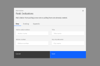
In all these places now the tabs should span across the full width of the modal and the extra space on the right should be filled with gray line (see attached picture)
