-
Type:
Task
-
Resolution: Done
-
Priority:
 L3 - Default
-
Affects Version/s: None
-
Component/s: frontend
-
None
AT:
On the Analysis Page
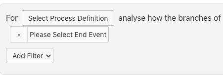
- instead of the current control panel with the labels and buttons, there is only one line of text: "For PROCESS DEFINITION analysise how the branches of GATEWAY affect the probability that an instance reached END EVENT." (Words in Brackets are replaced with the corresponding input elements). Filters are still displayed after the sentence
- When both gateway and end event are selected, the part between gateway and end event is highlighted
- The Statistics Panel is on the right instead of on the bottom
- There is a natural language summary of the information in the bar charts. The bar charts themselves are smaller and less prominent.
- is related to
-
OPT-897 I can perform a branch analysis
-
- Done
-