-
Type:
Task
-
Resolution: Unresolved
-
Priority:
L3 - Default
-
None
-
Affects Version/s: None
-
Component/s: webapp
-
None
Problem
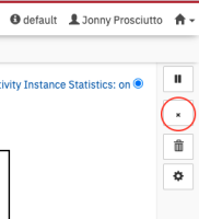
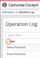
With CAM-5549, we shrank the glyphicon "remove" globally so that it fits for search pills and sorting. This looks odd at all other places where the icon is used since it differs in size compared to the other icons.
Acceptance Criteria (Required on creation):
Icon size fits all its use cases.
Solution Idea
Introduce a dedicated CSS class for the smaller icon version and use the original size for the default class.
Hints (Optional):
- Can be fixed here: https://github.com/camunda/camunda-bpm-platform/blob/master/webapps/ui/common/styles/glyphicon-overrides.less
- Remove workaround <span class="error-sign"></span> in webapps/camunda-commons-ui/lib/widgets/variables-table/cam-widget-variables-table.html
- is related to
-
CAM-13412 Cockpit
-
- Closed
-

