-
Type:
Bug Report
-
Resolution: Won't Do
-
Priority:
L3 - Default
-
None
-
Affects Version/s: None
-
Component/s: camunda modeler
Environment:
Camunda Modeler running on a Mac (Intel).
Description:
The Add![]() and Remove
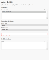
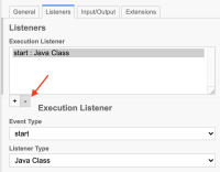
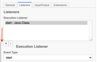
and Remove![]() buttons for Listeners and Input/Output are being covered by the dynamic panel that opens to edit the added element, making it very hard to add / remove elements as only the very top of the buttons are clickable, albeit the whole button is visible.
buttons for Listeners and Input/Output are being covered by the dynamic panel that opens to edit the added element, making it very hard to add / remove elements as only the very top of the buttons are clickable, albeit the whole button is visible.
- Image 1 - You can see the line of the panel and how little of the button is clickable (red arrow).
- Image 2 - You can see the panel itself and how it intrude on the button positioning (red arrow).
Steps to reproduce:
- Whilst on the Listener tab of a task
- When I click + to add a listener
- A new panel is opened just below with the listener properties
- Said panel covers almost the entirety of the Add
 and Remove
 listener buttons
The same behaviour also happens with the User task listener tab (in that case, the task listener buttons are covered by the panel), and on the Input/Output parameters tab (the output parameter buttons are covered).
Observed Behavior:
Panel covers almost the entirety of the buttons, partially blocking them.
Expected behavior:
Panel is created below the buttons, with a small padding to them.
Root Cause:
Seems to be a bad relative positioning of the dynamic panels in relation to the element on top of them, either it is using the top of the buttons as the base of the relative position, or it is ignoring the buttons altogether and positioning itself in relation to the text area on top of the buttons.
Solution Ideas:
Fix the relative positioning of the dynamic panels


