Environment (Required on creation):
Camunda Platform 7.15/7.16/7.17
Description (Required on creation; please attach any relevant screenshots, stacktraces, log files, etc. to the ticket):
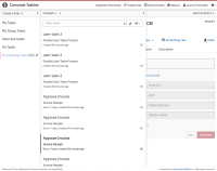
When updating Google Chrome to version 104, the width of the middle column in Tasklist is enlarged and overlays the details view.
Steps to reproduce (Required on creation):
- Start Camunda Platform
- Open Tasklist
Observed Behavior (Required on creation):
The middle column in Tasklist overlays the details view.
Expected behavior (Required on creation):
The middle column in Tasklist doesn't overlay the details view.
Root Cause (Required on prioritization):
To be defined.
Solution Ideas (Optional):
The width of the middle column is not flexible anyways: remove right: 100%; margin-right: -??px and replace it with the respective width: ??px for each media query breakpoints.
Hints (optional):
- The deployment page in Cockpit is affected as well.
- Check if the layout at other places in the Webapps is broken.
- I suspect that introducing media queries syntax level 4 causes the problem [1]
[1] https://developer.chrome.com/blog/new-in-chrome-104/#mq-math
- is related to
-
CAM-14809 Tasklist Column Issues in Microsoft Edge
-
- Closed
-
