-
Type:
Task
-
Resolution: Fixed
-
Priority:
L3 - Default
-
Affects Version/s: None
-
Component/s: cockpit
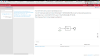
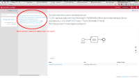
In the cockpit deployment view the whole resource name is displayed. This is very verbose and huge. Maybe we should shorten this display name?
See the attached screenshot for an example of the standalone webapp standalone-webapp.png![]()

