-
Type:
Task
-
Resolution: Fixed
-
Priority:
 L3 - Default
-
Affects Version/s: None
-
Component/s: cockpit
-
None
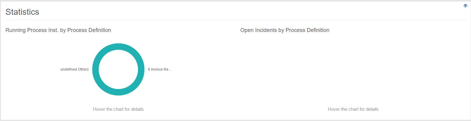
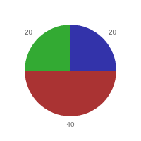
Create pie charts for cockpit dashboard

- Assignee:
-
Unassigned
- Reporter:
-
Valentin
- Votes:
-
0 Vote for this issue - Watchers:
-
2 Start watching this issue
- Created:
- Updated:
- Resolved: