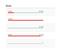
Improve the display of the status of a process definition, its running instances and incidents in a way that is:
- more compact
- visualizes the relation between incidents and 'good' running instances
We can get rid of the "Incidents" and "Running Incidents" table headers and columns, since this information is included with the new status graphs.
It would be good to have tooltips on each part of the graph, like (for the first one in the image): "1000 Incidents" and "10.000 Running Instances" respectively.
Colours in the diagram's batches ideally should match the colours in the graph (this requires some extra work, because the colours need to work in different contexts / backgrounds). In a first round, we should probably just use the same colours as in the badges in diagrams and check whether they work sufficiently well.
