Use Icons for List and Card ("Preview") View Modes

XMLWordPrintable

    • Type: Task
    • Resolution: Won't Fix
    • Priority: L3 - Default
    • None
    • Affects Version/s: None
    • Component/s: None

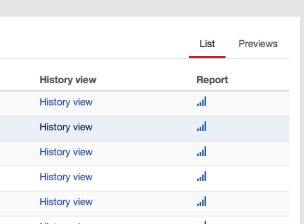
      Currently, Cockpit uses textual links (that behave like tabs) to toggle between "List" and "Previews" (commonly referred to as "Card View") view modes.
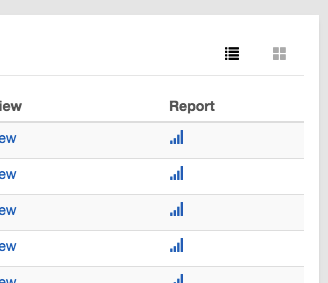
      There is a very common pattern using icons to represent this, and we should use it in order to stick to common UI patterns and reduce the amount of information on the screen that needs to be read in order to be processed.

      The icons to be used from bootstrap's glyphicons are:

      List View:

      

      or

      

      Card View (aka "Previews") :

      

      or

      

        This is the controller panel for Smart Panels app

              Assignee:
              Unassigned
              Reporter:
              Franz
              Votes:
              0 Vote for this issue
              Watchers:
              2 Start watching this issue

                Created:
                Updated:
                Resolved: