Uploaded image for project: 'Camunda Optimize'
  1. Camunda Optimize
  2. OPT-1117

Wrong diagram axis labeling for duration charts

    • Icon: Bug Report Bug Report
    • Resolution: Fixed
    • Icon: L3 - Default L3 - Default
    • 2.0.0
    • None
    • None
    • None

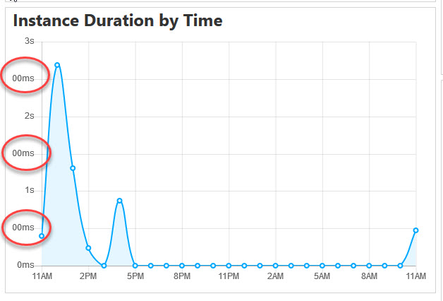
      See attached screenshot. The y-axis of the diagram is subdivided into seconds and millisecond steps. Mixing different units is confusing for the user. For a better user experience the diagram axis should use only one unit for the labeling.

      Furthermore the area on the left of the y-axis seems to be to small. So the full value cannot be displayed.

        This is the controller panel for Smart Panels app

            [OPT-1117] Wrong diagram axis labeling for duration charts

            Johannes added a comment -

            Review hints:

            • Chart.js: I really like the trick with the niceStepSize matrix and just finding the maximum. However, the maximum of the data is now computed 14 times instead of just once. For a huge data that set might become an issue.
            • Chart.js: the createChartOptions(...) function now consists of 80 lines of code handling different matters at once. Therefore, I would suggest to move the new for the formatting in a new function to clean that up a bit.
            • At least one test would be nice to show would the expected behavior is. With the previous step implemented, this should also be a lot easier.
            • there is now a bug: you choose view -> average instance duration, group by -> start date of process instance -> visualize as bar/area. Then you switch the view to count process instance frequency and the y-Axis again uses your duration formatting. However, that should have changed. If I now change back the view, the formatting is not displayed at all anymore, but only the raw values.

            Johannes added a comment - Review hints: Chart.js: I really like the trick with the niceStepSize matrix and just finding the maximum. However, the maximum of the data is now computed 14 times instead of just once. For a huge data that set might become an issue. Chart.js: the createChartOptions(...) function now consists of 80 lines of code handling different matters at once. Therefore, I would suggest to move the new for the formatting in a new function to clean that up a bit. At least one test would be nice to show would the expected behavior is. With the previous step implemented, this should also be a lot easier. there is now a bug: you choose view -> average instance duration, group by -> start date of process instance -> visualize as bar/area. Then you switch the view to count process instance frequency and the y-Axis again uses your duration formatting. However, that should have changed. If I now change back the view, the formatting is not displayed at all anymore, but only the raw values.

            I created a separate ticket for the bug as it is independent of this issue.

            Sebastian Stamm added a comment - I created a separate ticket for the bug as it is independent of this issue.

            Johannes added a comment -

            Nice

            Johannes added a comment - Nice

              Unassigned Unassigned
              michael.schoettes Michael Schoettes
              Votes:
              0 Vote for this issue
              Watchers:
              3 Start watching this issue

                Created:
                Updated:
                Resolved: