-
Type:
Bug Report
-
Resolution: Fixed
-
Priority:
L3 - Default
-
Affects Version/s: None
-
Component/s: None
-
None
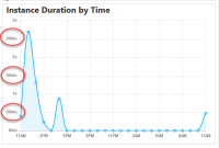
See attached screenshot. The y-axis of the diagram is subdivided into seconds and millisecond steps. Mixing different units is confusing for the user. For a better user experience the diagram axis should use only one unit for the labeling.
Furthermore the area on the left of the y-axis seems to be to small. So the full value cannot be displayed.
- is related to
-
OPT-1146 Chart Axis wrong after switching View
-
- Done
-
