-
Type:
Design Part
-
Resolution: Done
-
Priority:
L3 - Default
-
Affects Version/s: None
-
Component/s: None
-
None
-
Not defined
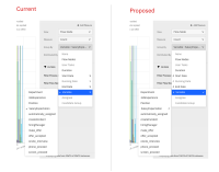
List is WIP
• Display filter section closed by default.
• Width of sidebar increased by 20px
• Inputs increased to 200px width
• Left align labels (5px margin between label and component)
• Distribute by --> Distribution
• Nothing --> None (we use none in group by - nothing is too natural language sounding.)
• Section collapsed arrow to face right (align with modeller)
• Menu arrows face the direction of the menu opening - Discuss, may be a separate topic (see screenshot)
Design -> https://zpl.io/aX74DRP
Improve add measure button
Why? In preparation for multi reports Phase III where we can add comparisons
Design add measure button -> https://zpl.io/Vq7DqJN
Prototype -> https://drive.google.com/file/d/1ddDLJ5UxIOScc4eq1sN60aRQLmVxEAiM/view?usp=sharing
- is related to
-
OPT-4984 Processes and the Report builder
-
- Done
-
