Uploaded image for project: 'Camunda Optimize'
  1. Camunda Optimize
  2. OPT-1177

Slices of Pie Charts with lots of data points not distinguishable

    XMLWordPrintable

Details

    • Feature Request
    • Resolution: Unresolved
    • L3 - Default
    • None
    • None
    • frontend
    • 4
    • L

    Description

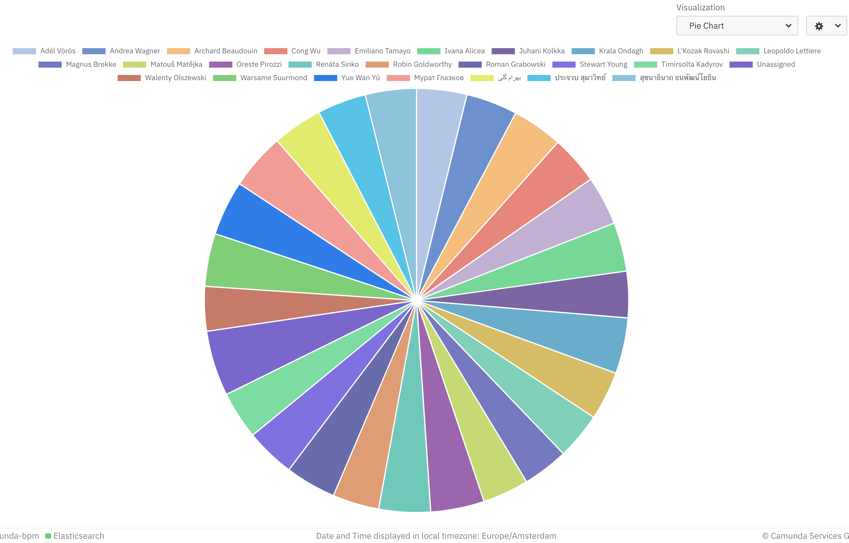
      As of OPT-1176, colors are dynamically generated for the pie slices. However, when you have more than 6 or 7 entries, the colors become hard to distinguish. We should think about a solution like only showing the top x entries and group the rest into an "Others" slice.

      Hints: 
      A good video on how can we improve this: 
      https://youtu.be/9kp2Nu_LuXg?t=251

      mgm-controller-panel

        This is the controller panel for Smart Panels app

        Attachments

          Issue Links

            Activity

              People

                felix.mueller Felix Mueller
                sebastian.stamm Sebastian Stamm
                Votes:
                0 Vote for this issue
                Watchers:
                3 Start watching this issue

                Dates

                  Created:
                  Updated:

                  Salesforce